Building programs with Python
Data Visualisation
Learning Objectives
- Displaying simple graphs
- Plotting data using matplotlib library
The mathematician Richard Hamming once said, “The purpose of computing is insight, not numbers,” and the best way to develop insight is often to visualize data. Visualization deserves an entire lecture (or course) of its own, but we can explore a few features of Python’s matplotlib here. While there is no “official” plotting library, this package is the de facto standard. First, we will import the pyplot module from matplotlib and use two of its functions to create and display a heat map of our data from the previous topic:
from matplotlib import pyplot
image  = pyplot.imshow(data)
pyplot.show(image)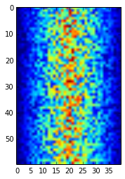
Heatmap of the Data
Blue regions in this heat map are low values, while red shows high values. As we can see, inflammation rises and falls over a 40-day period. Let’s take a look at the average inflammation over time:
ave_inflammation = data.mean(axis=0)
ave_plot = pyplot.plot(ave_inflammation)
pyplot.show(ave_plot)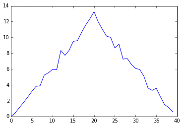
Average Inflammation Over Time
Here, we have put the average per day across all patients in the variable ave_inflammation, then asked pyplot to create and display a line graph of those values. The result is roughly a linear rise and fall, which is suspicious: based on other studies, we expect a sharper rise and slower fall. Let’s have a look at two other statistics:
max_plot = pyplot.plot(data.max(axis=0))
pyplot.show(max_plot)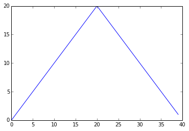
Maximum Value Along The First Axis
min_plot = pyplot.plot(data.min(axis=0))
pyplot.show(min_plot)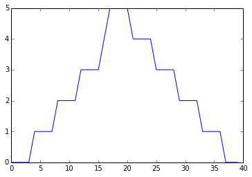
Minimum Value Along The First Axis
The maximum value rises and falls perfectly smoothly, while the minimum seems to be a step function. Neither result seems particularly likely, so either there’s a mistake in our calculations or something is wrong with our data.
It’s very common to create an alias for a library when importing it in order to reduce the amount of typing we have to do. Here are our three plots side by side using aliases for numpy and pyplot:
#!/usr/bin/python

import numpy as np
from matplotlib import pyplot as plt

data = np.loadtxt(fname='../data/inflammation-01.csv', delimiter=',')

fig = plt.figure(figsize=(10.0, 3.0))

axes1 = fig.add_subplot(1, 3, 1)
axes2 = fig.add_subplot(1, 3, 2)
axes3 = fig.add_subplot(1, 3, 3)

axes1.set_ylabel('average')
axes1.plot(data.mean(axis=0))

axes2.set_ylabel('max')
axes2.plot(data.max(axis=0))

axes3.set_ylabel('min')
axes3.plot(data.min(axis=0))

fig.tight_layout()

plt.show(fig)
In the above code (also present under code directory in the file three-plots.py), tight_layout still works by falling back to the Agg renderer, only warning as below.
/System/Library/Frameworks/Python.framework/Versions/2.7/Extras/lib/python/matplotlib/tight_layout.py:225: UserWarning: tight_layout : falling back to Agg renderer warnings.warn("tight_layout : falling back to Agg renderer")
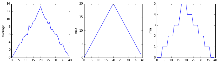
The Previous Plots as Subplots
The call to loadtxt reads our data, and the rest of the program tells the plotting library how large we want the figure to be, that we’re creating three sub-plots, what to draw for each one, and that we want a tight layout. (Perversely, if we leave out that call to fig.tight_layout(), the graphs will actually be squeezed together more closely.)
Make your own plot
Create a plot showing the standard deviation of the inflammation data for each day across all patients. Hint: data.std(axis=0) gives you standard deviation.
Moving plots around
Modify the program to display the three plots on top of one another instead of side by side.